


well, she's now in all her splendid color glory!! the paper i did it on is different textures (rougher) toward the bottom, in case you were wondering about the grooves. i love the light color scheme in this! i'm really happy i finally colored it!


* Home * Updates * Fan Art * Sketches * Stamps *
* Grafitti it Up * Art 4 Sale * Nyo * About Me * Mail Me * Links *
~Originals~
|
this is kind of an ode to a great starry night i witnessed at a camp in new hampshire. you could see the stars...all of them, i swear it. one of the most spectacular sights, just laying out on the grass. you could see the milky way, and you couldn't even count the shooting stars. just stars...everywhere. err...i kind of suck at using this 'mujabi' watercolor paper...it makes a lot of the colors run together, and thus the girl has kinda blue-tinted skin. drew this QUITE a few years back. ^_^ (the yellow line's coming down the side is the scanner, not the pic) | |
|
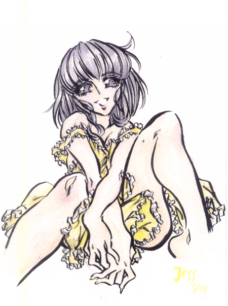
riiiite. a bit provacative, i know. but ever since i got my first gander at utena through animage and newtype i fell in love with the art. SO! i really wanted to know if i could mock it. i guess i could!! grr..and as soon as i finish a piece, it always gets ruined with the VERY LAST touch i add. i.e. this one was defiled w/ forgot-i-put-on-more-ink smudges. really a shame, but all in all, it is a nice pic. i also put some 'dirt-ish' effects on her knees and legs to make it look like she's been playing or something. add to the naughty innocence, i suppose... | |
|
originally, i drew the picture of this wind goddess in my leatherbound sketch w/ her hair turning into feathers at some parts, and a kind of 'cloud shawl.' i really liked the idea, so i added a male character. i wanted to make a pic of him courting her, with emotion in it ( although his character is pretty emotionless ^_^;;). the pic was really yellow at first, but then i intertwined the blue into her yellow cloud, and the whole picture tied together so beautifully. a favorite among all i show it to. | |
|
this
is another picture of my wind goddess. i guess i made her just waking up,
but everyone says she looks sad -_-;; well, she's now in all her splendid color glory!! the paper i did it on is different textures (rougher) toward the bottom, in case you were wondering about the grooves. i love the light color scheme in this! i'm really happy i finally colored it! |
|
|
choku parfait had given me the idea for this one, but i'm not sure why -_-;; really, up until about 9/13 it hadn't been touched for MONTHS and MONTHS. it was just this floating body leaning against nothing! but then i found out tamara liked it and decided to paint it ^_^;;. i was still getting used to the mujabi paper, though~. | |
|
well, again, tamara's to blame. her, kasai ayumi, and B. Leopardi. Kasai-sama gave me the trippish idea, tamara with the 'draw me a bishonen' input, and the last one? for his quote: "Devil, don't you know you are as beautiful as an angel" ...it's worth it, i'd say..^_~ arrgh...am i ever gonna color this?? it's been put in a side-pile of things i need to 'tweek' in my art-folio (really just a clutter on my desk -_-;;). | |
|
this is kai, o-chan's love interest. (actually, it's more the other way around). from one of those storylines i'll never actually make into a manga even though i have it all worked out. i just draw the characters ^_^. i love kai, i really do. so i'm scared to color it!! hahaha...oh well. i'll...'do it later.' =P ( really shouldn't have put the two non-color ones next to each other and profess my color-procrastination...) | |
|
mmm...so blue!! well, this was from a 20-minute sketch i did, then i colored it w/ tamara next to me, and she suggested a different colored ink than black to ink it in, so we chose blue, then flew w/ it. i left his skin light for contrast and feeling. i love the deep blue around him. the paper was mujabi which i'm getting MUCH better at ( same paper as the wind goddess). i improved a lot in watercolor since my starry calumet picture, don't you think? mujabi still isn't as easy to work with as coldpress arches, but it give a different effect. | |
|
hrm...this
is a random girl from a magazine...well, the general position was from a
mag, (not the face or hair or anything) and i thought it was cute and i'd
draw my own version. light kinda picture. it was empty, so on a whim i did
bubbles w/ green, yellow, magenta, and blue. the shades were kinda gross
alone, but they work well together, and add to the light hazy steamy bath
effect. i did splatters on the sides to eccentuate the colors in the piece,
and to add some fun. it was on 9"x12" arches watercolor. maybe
you can tell the color technique difference and spreading/evenness of color
in the mujabi and arches? |
|
|
hehehe~this is an OOOOOLD picture from May 99' that i decided to put up. i'm working on a section to put up that's a bunch of my old, old, old art that will encourage aspiring artists that aren't so good. Kind of a light that things will improve. ^_^;; | |